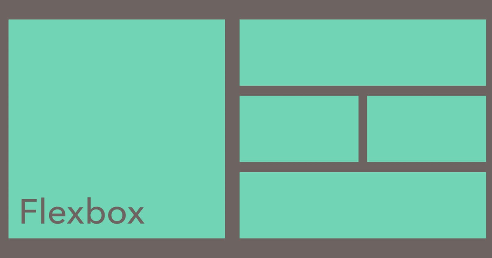


The Flexbox Layout module of CSS provides an efficient way to layout and align space for any web dev project. Flex layout gives you the ability to alter your item’s width and height to best fill the available space and accommodate different kinds of screen sizes.
What is CSS Flexbox?
Crafting intelligent page layouts with CSS has been tricky in years past. Before flexbox was introduced, web developers had to use floats and table display hacks, often leading to unexpected issues. The CSS flexbox model introduced a cleaner, modern syntax for crafting intelligent layouts.
The flexbox model provides an efficient way to lay out, align, and distribute space among elements, even when the viewport and element size is dynamic or unknown.
To start using the flexbox model, we first define a flex-container. Let’s see how that’s done. First, look at some regular HTML.
<ul> <!--parent element-->
  <li></li> <!--first child element-->
  <li></li> <!--second child element-->
  <li></li> <!--third child element-->
</ul>
In this code above, you’d call the ul the parent element and the li the child element. We do the same with the flexbox model. We must first make a parent element, called a flexible container.
You do this by setting display: flex or display: inline-flex for the inline variation.
/*Make parent element a flex container*/
ul {
  display: flex; /*or inline-flex*/
}
We can add a bit of styling and color with CSS to this, as we do below. Take a look at the code below to see how the parent element looks.
/*Make parent element a flex container*/
ul {
  display: flex; /*or inline-flex*/
  list-style: none;
}

li {
  width: 100px;
  height: 100px;
  background-color: #8cacea;
  margin: 8px;
}
Output:

The unordered list automatically becomes the flex container (parent), and the child elements (the list elements li) become the flex items. Some properties in the flexbox module apply to the flex items, and some are set to the container.
Flex layout
Flexbox word is made up of two words which is flexible and box . It is designed as one dimensional layout model which means by using flexbox either we can arrange our items vertically or horizontally .
The flex layout is based on flex-flow directions. Look at this figure to better understand the ideas behind the flex layout.

Main-axis :
The Main axis in the flexbox by default is horizontal direction but if the flex direction is column then the main axis is vertical direction .
As you can see, items are laid out following either the cross axis (from cross-start to cross-end) or main axis (from main-start to main-end).
flex-direction: controls the direction in which the flex-items are laid along the main axismain axis: this is the primary axis that flex items are laid out along. It is not always horizontal.main-start/main-end: flex items are set within a container starting from themain-starttomain-endmain size: an item’s width or height will be the main size (whichever is in the main dimension)cross axis: This is the axis that is perpendicular to the main axis.cross-start/cross-end: flex lines are set within a container starting from thecross-startside to thecross-endsidecross size: width or height of a flex item is the item’s cross size (whichever is in the cross dimension)
Flex container properties
The flex container is the parent element that holds the individual children or flex items. There are several properties we can use to create the flex container we want. Let's examine the most important flex container properties.
display
As we showed above, display defines a flex container, either inline or block.
.container {
  display: flex; /* or inline-flex */
}
flex-direction
flex-direction determines the main-axis, so it defines the direction that flex items are set in the container.
Generally speaking, flexbox is a single-direction layout concept, so they are either in horizontal rows or vertical columns.
.container {
  flex-direction: row | row-reverse | column | column-reverse;
}
Technically, “horizontal” and “vertical” aren't terms we use in flexbox. Instead, the main-axis default direction feels like horizontal, and the cross-axis feels like vertical.
By default, the flex-direction property is set to row and aligns along the main axis. If the flex-direction property is changed to column, flex-items will be aligned along the cross axis.
flex-wrap
Flex items will try to fit onto one line by default. We can change this with flex-wrap. The flex wrap property can take on three values:
//where ul represents a flex container
ul {
  flex-wrap: wrap || no-wrap || wrap-reverse;
  }
nowrap(default): flex items are on one linewrap: flex items are wrapped onto multiple lines (top to bottom)wrap-reverse: flex items are wrapped onto multiple lines (from bottom to top)
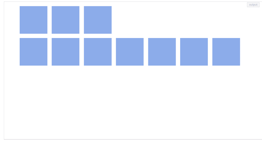
Here is an example of wrap-reverse:
ul {
      display: flex; /*or inline-flex*/
      list-style: none;
    flex-wrap: wrap-reverse;
    }

li {
      width: 100px;
      height: 100px;
      background-color: #8cacea;
      margin: 8px;
    }
Output:
flex-flow
flex-flow is shorthand for the properties flex-direction and flex-wrap. Together, they define the flex container’s main and cross axes. This is similar to the border shorthand.
ul {
    flex-flow: row wrap; /*direction 'row' and yes, please wrap the items.*/
}
Other combinations this could take:
flex-flow: row nowrap,flex-flow: column wrap,flex-flow: column nowrap
justify-content
justify-content is for alignment along the main axis. The three flex-items may be aligned across the main-axis however you need. This property takes on any of the values below.
ul {
    justify-content: flex-start || flex-end || center || space-between || space-around
}
flex-start(default): items are placed at the start offlex-directionflex-end: items are placed at the end of flex-direction.start: items are placed at the start of thewriting-modedirectioncenter: items are centeredspace-between: items are evenly distributedspace-around: items are evenly distributed with equal space between and around them
align-items
align-items defines how your flex-items are laid out on the cross axis. It can be set to any of these values:
/*ul represents any flex container*/
ul {
    align-items: flex-start || flex-end || center || stretch || baseline
}
stretch(default): items will fill the containerflex-start / start / self-start: items are placed at the start of the cross axisflex-end / end / self-end: items are placed at the end of the cross axiscenter: items are centered along the cross-axisbaseline: items are aligned along their baselines
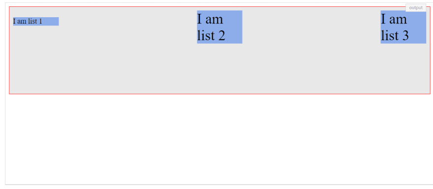
Let’s look at an example of baseline below:
ul {
            display: flex;
            border: 1px solid red;
            padding: 0;
            list-style: none;
            justify-content: space-between;
            align-items: baseline;
            min-height: 50%;
            background-color: #e8e8e9;
        }

        li {
          width: 100px;
          background-color: #8cacea;
          margin: 8px;
        }

        /* apply to all list items except the first one*/
        li:not(:first-child) {
            font-size: 2rem;
        }
Output:
align-content
The align-content property is used on multi-line flex-containers. It takes the same values as align-items (except for baseline).
.container {
  align-content: flex-start | flex-end | center | space-between | space-around | space-evenly | stretch | start | end | baseline | first baseline | last baseline + ... safe | unsafe;
}
normal(default): items are placed in default positionflex-start / start: items placed to the start of the containerflex-end / end: items placed to the end of the containercenter: items are centeredspace-between: items are distributed evenlyspace-around: items are evenly distributed, and the first line is at the start of the container with the last at the endspace-evenly: items are evenly distributed with equal space around and between themstretch: items are stretched to take up remaining space of your container
Flex item properties
Just as our container or parent has its own properties, so do our items. Let's look at the main properties for aligning our flex items.
order
The order property allows you to reorder the flex items. Basically, you can move a flex-item from one position to another. The default value for the order property is 0. It may take on either negative or positive values.
Flex items are re-ordered based on the number values of the order property, from lowest to highest. For example:
.item {
  order: 5; /* default is 0 */
}
flex-grow and flex-shrink
The flex-grow and flex-shrink properties control how much a flex-item can grow (extend) if there are extra spaces or shrink if there are no extra space. They may take up any values ranging from 0 to any positive number.
For example, if all flex items have flex-grow set to 1, then the remaining space is equally distributed to the other children items.
The value
0is like a “turn-off” switch for this property.
.item {
  flex-grow: 3; /* default 0 */
}
.item {
  flex-shrink: 2; /* default 1 */
}
flex basis
The flex-basis property specifies the initial size of a flex-item, which can be a length (e.g. 20%) or a keyword. For example, the auto keyword states that the width or height property is used.
.item {
  flex-basis:  | auto; /* default auto */
}
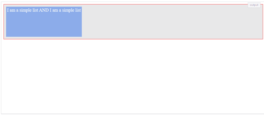
Let's set a flex-item to a fixed width:
ul {
            display: flex;
            border: 1px solid red;
            padding: 0;
            list-style: none;
            background-color: #e8e8e9;
        }

li {
            flex-basis: auto;
            background-color: #8cacea;
            margin: 8px;
            min-height: 100px;
            color: #fff;
            padding: 4px;
        }
Output:
flex
The flex shorthand allows you set the flex-grow, flex-shrink, and flex-basis properties at once.
li {
  flex: 0 1 auto;
}
Here, the code is equal to setting the three properties: flex-grow: 0; flex-shrink: 1; flex-basis: auto.
align-self
This property allows you to override the default alignment. For example, you could use it to change the position of a single flex-item along the cross-axis without affecting the neighboring flex-items. It can take these values, which should already be familiar to you:
li:first-of-type {
    align-self: auto || flex-start || flex-end || center || baseline || stretch
}